Wednesday, 28 April 2010

Festival research
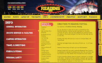

Reading
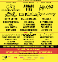
The festival is from 27th to 30th August and is held in Reading is where it got the festival name from.
The festival has many bands and singers going on. Such as Guns and Roses, Blink 182 and Paramore. 

The target audience is 16+ for rock/indie genre. It can have younger childern who come a long with 18+ and doesnt often interst people who like hip hop and R&B.

The funding for the event is from ticket sales and sponsers:
- BBC
- NME
- Tuborg
- Gaymers Cider
- Pepsi Max
- Relentless
- Viagogo

The whole point of the festival is to get all the great bands together and people to have a great time enjoy big bands all at once.

Festival research

LOCAL


Strawberry Fair

The festival is normally the 1st Saturday in June, it takes place on midsummers common in Cambridge. It is a large field in the centre of Cambridge. The festival has so many things going on such as: 
- Beer Tent
- Music Stages with bands from the local areas
- All different types of food and drinks.
- Many stalls with all different types of goods [clothes, art, hand crafted and jewelry]

The target audience can range from very young people to a lot older 'hippys', families and friends enjoy the day and night event. Different types of music such as indie/rock to reggae. The stalls have all sorts of things and all different genres. 

It is funded by the local council how ever this year they pulled out and the event is not on, so this year they are asking for donations to help the festival be there next year.

Strawberry Fair is a free volunteer run community music, entertainments, arts and crafts fair.
Across the Fair, Strawberry Essence aims to make the site an altogether nicer, happier, more colourful place through static and more imaginative décor, and wandering entertainment.

So they basically want to give the area some big vibe and an exciting event.

Tuesday, 30 March 2010

kettles yard

It was created between 1958 and 1973 and was the home of Jim and Helen Ede.
From the website :
In the 1920s and 30s Jim had been a curator at the Tate Gallery in London. Thanks to his friendships with artists and other like-minded people, over the years he gathered a remarkable collection, including paintings by Ben and Winifred Nicholson, Alfred Wallis, Christopher Wood, David Jones and Joan Miro, as well as sculptures by Henri Gaudier-Brzeska, Constantin Brancusi, Henry Moore and Barbara Hepworth.

At Kettle's Yard Jim carefully positioned these artworks alongside furniture, glass, ceramics and natural objects, with the aim of creating a harmonic whole. His vision was of a place that should not be

"an art gallery or museum, nor ... simply a collection of works of art reflecting my taste or the taste of a given period. It is, rather, a continuing way of life from these last fifty years, in which stray objects, stones, glass, pictures, sculpture, in light and in space, have been used to make manifest the underlying stability."

Kettle's Yard was originally conceived with students in mind. Jim kept 'open house' every afternoon of term, personally guiding visitors around his home. In 1966 he gave the house and its contents to the University of Cambridge. In 1970, three years before the Edes retired to Edinburgh, the house was extended, and an exhibition gallery added.

Today each afternoon (apart from Mondays) visitors can ring the bell and ask to look around.
How do you visit the house ?
What is displayed in the house ?

kettles yard

Wednesday, 17 March 2010

Section 4 Research


http://www.hairygrowler.co.uk


Everything made at our workshop and studio is unique, meaning it will be only for you. Each and every piece of jewellery is crafted by hand using only recycled raw materials. This simple, natural process means that each piece is closely connected to its maker and the little individual marks and subtle movements of tools that are sometimes visible are what make our pieces so special.

At The Hairy Growler we specialise in the unique, the ‘one off’, the exclusive, and so, we love to carry out commissioned work. Do you have a lovely little design fluttering in your mind? Or, would you like us to adapt one of our own designs, to make it well and truly ‘you’? Whatever it may be, we will work closely with you, ensuring you’ll see the unique parts of yourself, in your finished piece. Prices for commissioned work obviously depend on design and materials, but if you reference the work within these pages, you’ll get a relevant indication of cost.verything made at our workshop and studio is unique, meaning it will be only for you. Each and every piece of jewellery is crafted by hand using only recycled raw materials. This simple, natural process means that each piece is closely connected to its maker and the little individual marks and subtle movements of tools that are sometimes visible are what make our pieces so special.

At The Hairy Growler we specialise in the unique, the ‘one off’, the exclusive, and so, we love to carry out commissioned work. Do you have a lovely little design fluttering in your mind? Or, would you like us to adapt one of our own designs, to make it well and truly ‘you’? Whatever it may be, we will work closely with you, ensuring you’ll see the unique parts of yourself, in your finished piece. Prices for commissioned work obviously depend on design and materials, but if you reference the work within these pages, you’ll get a relevant indication of cost.


Wednesday, 10 March 2010


1)
In the Junction there is 3 different areas to the venu :
- Junction 1 mostly holds music preformance 
- Junction 2 is mostly for arts and theatre
- Junction 3 is mostly for workshops

2)
Target Audience?
The Junction is for intersts for all sorts of people and ages.
They hold :
-Clubs
-Comedy 
-Dance
-Music
-Theatre
-Community


Preperation For The Junction

Qualifications-

What Qualifications are helpful to get a job in the Junction?

Do you think any courses you took at college/uni prepared for your job?

What courses do you recommend to take if wanting to get in to the industry?


Tuesday, 9 March 2010

My Logo Idea is a lamp with the name of the newspaper 


Monday, 8 March 2010

Section 2


http://www.e-nox.net

On the site they say that : 
All of our artists have science and engineering backgrounds that enable them to truly understand your specifications, then present your concepts in a visually engaging and attractive way.

All their stuff is based around the Cambridge Science and turned in to a Arty films.

Wednesday, 3 February 2010

Update

We have now completed all the mask and t-shirts,

Tuesday, 26 January 2010

Cramba sessions

26/01/10 - Today I am sorting out the budget for the whole order of products as it was cut by half. I am ordering the masks today which comes 

27/01/10 - Today we are finaly ordering the mask and writing the list for the art materials. Cutting out the t-shirt logo and spraying on the t-shirt.


Monday, 18 January 2010

orange sheet

arco iris samba
Their costumes are very colourful and bold, colours as bright red. Each top has a lprint of the groups logo. The preformance is a lot more lively and dancey, more exciting. I think they create a sense of band identity with there mix of people but all. They are all very up beat and smiles and dancing a long to one another to interact, they have a leader to with a whistle to get everyone together. They invole people by being right in the centre of some where busy and making it very up beat and likeable. They arrange themselves by grouping instermuents together and similar sounds.

the Thudbox - Bal a
Their wearing what ever they fancy wearing, quite dull colours so they dont stand out. They are a lot smaller group. They have a lot more relax approach to their performance. They create their band with their laid back, mellow approach. They just seem to smile and remember when to just start when interracting with one another. They smile and idrect looks towards people to feel like they are involed. They dont have to much of an order on stage. The lights are good as they highlight the people well with out being to powerful.

Friday, 15 January 2010

homework


I chose this video as I like the natural feel of a random band playing in the streets with friends and family. I think the preforamance is very goood and there is great feel from the men playing.
They have no costume, they are dressed in everyday which gives it more of an natural, fun feel. It has been filmed on a street in Philadelphia in Rittenhouse Square, the information on the video is:

Our Villanova/University of Arts Class takes it to the streets of Philadelphia in Rittenhouse Square. Led by Lee Higgins of England, we learned how to rock it out Brazillian style! What you see is our Samba Reggae, with an interlude into Samba Reggaeton! The beginning got cut off, doh! Still, it's great! Led by the fabulous Tim Thompson. Instruments - Repinique, Surdo, Caixa, Samba Whistle. Enjoy!

I think my expreince with samba is slightly like the video as it was natural just like the class,

Monday, 11 January 2010

Email for campaign

I am planning to send an email to the company 'Stagecoach' and 'Wippet' who are two big bus companys

Campaign


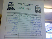
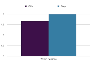
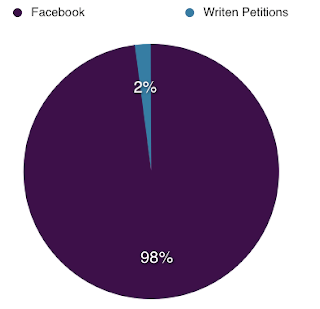
My campaign on facebook had 507 people join and a lot join who were not on my friends list and who agreed with the campaign, how ever I didnt have much success with the petition on at the bus stops, I only got 11 people to sign. I think the facebook group works more as it is when people can easily join with out having to stop doin their bussiness and facebook is when people are joining and talking.
 

Friday, 8 January 2010

Reflection from campaign day

How did your plan change and why?
It started off well how ever because of the weather there were getting less and less students being on the buses and coming off the buses in town which made it hard to get them to talk to. 

How succesful was your campaign day?
It was not as succesful as I 1st wanted it to be, I was disspointed in the amount of signings.

What would you do differently?
I would of stayed in college and gone to the refrectory or bus stop out side college as there was most problem more students there then I thought there would be in town.

Next week I am going to get an online petition for my facebook group so it is easier to get to and people from all over the place can sign up.

Wednesday, 6 January 2010

Plan for todays campaigning

Today I am planing to go the main bus stops in the centre of cambridge to ask many people to look at my campaign, main targets are students. I will explain to them my idea of how it's a good idea for it to happen and why it would benifit the buses. It may take a while for people to be wanted to listen and wait for the information I am telling.
i would infulene them with my personality and target the students,

Tuesday, 5 January 2010

Petition

Free Bus Fare For College Students [16-19]


We, the undersigned, want to 

get free bus fare for college students


Tuesday, 15 December 2009

Facebook Group


I created a Facebook group on my campaign yesterday [14/12/09] and my group has already nearly hit 200 members. It is showing to me that the target audience is interested in the group and would want it to be in action. The members are growing every time I refresh the page.

Thursday, 10 December 2009

Research on my Campaign

http://theboar.org/news/2009/mar/10/students-union-campaign-against-rising-bus-fares/
They are talking about how stagecoach has raised their prices once again and students are against the raise.

A group of people have set up a campaign for free transport in greater manchester, they have many companys and organsations to help get the cause in action. All sorts of people are signing up for this campaign, school kids, people wanting to reduce the cars off the roads.

Normal people have set up a basic web page on the side 'Bebo'. They arent happy about the increase of the price of the ticket and just adding that to each of their tickets turns a lot more money overall in the year just on bus travel.

Campaign Research

Supporting Cambridge Postal Workers
Communication Workers Union (CWU) Eastern No4 Branch can confirm that Postal Delivery members employed at Cambridge Delivery Office (Henley Road) Ely Delivery Office along with the villages of Soham, Haddenham and Isleham will take 24 hours of industrial action on Tuesday 29th September 2009. 
They are fighting for the defence of Trades Union rights, and conditions of service. The Government is out to attack a key public sevice with the aim of privitising it. If they succeed it will be easier for them to attack other workers and services - they deserve all our support for the stand they are taking.

Workers are striking as they do not believe in the low pay and modernising the of the company. My view on this is that it is not good to strike as it is stopping others who need to receive their mail, I lost on a months pay as my company did not get my time sheet. Though I do understand why they did this.

Tuesday, 1 December 2009

Three Questions to ask students

The questions are towards my campaign 'Free bus fare for students [16-19]'

1. Do you think this campaign would be helpful for a lot of college students?
2. Would you join/be part of this campaign to get the cause in action?
3. Do you think is one of the things college students worry about?

Monday, 23 November 2009

Blog Reflection

1. What did I do today?
I added information on the Blogger about my Photoshop final design for stenciling on to my t-shirt. I also added a link to the blog so it can be found on flickr, I think the link is good, incase the picture does not show up on page or even to prove that it is my stencil

2. What went well and why?
3. What could have i done differently?
4. what do I have to do tomorrow?

Wednesday, 18 November 2009

Campaign design


My campaign is Free Bus Fare For 16-19 Year Old Students. This was the campaign that came up on top on my 'Facebook' poll. This is the final Photoshop stencil overall picture, this is how it would look hopefuly on the T-shirt. I had to create different layers after for each colour for the screen printing.

Sunday, 15 November 2009

My Top 5 Tips For Myself

1. Make it big and bold, makes it easier and looks better when sprayed.
2. Cut carefuly around the shapes to give it a clean look
3. Think about bridges when planning
4. Make it simple but eye catching
5. For each layer, different stencils for each colour is needed

Friday, 13 November 2009

Stencil Art Evaluation

Stage One : Drawing An Image By Hand
Drawing the idea to how you actually want it to look like can be good but in a way harder to get it perfect in shape and appearence. I am most pleased about how it turned out to look, with the fun comic book look to the letters. If I could change what I did and do it again I would use a ruler on the words to give a better shape to the letters.

Stage Two : Re-Creating Your Design On Photoshop
I learnt with this technique that everything with in the picture can be placed and sized better and can be changed over and over again with out messing up what you started with. I am most pleased about the stencil on photoshop was how I could size everything to be as bold and in your face as I could make it. If I could change anything, it could be the font of the writing, make it look more 'Comic Book' style and I would of liked it a lot bigger when it is on the t-shirt.

Stage Three - Cutting Out A Stencil On Acetate
I learnt that its not easy to cut out rounded shapes, such as my heart. Not easy to give it a clean edge. I am pleased with my end of all the cutting becuase the letters were alot easier then if I did a detailed picture. If I could change anything I would of probely pasted myself and took the paper off the back before trying to cut around.

Stage Four - Spray-Painting Your Stencil Design
I learnt that its good to do it quick and pretty close to get a very bold colour, or it will be blotchy. What I'm most pleased about is the how bold it come out and with the spray around the letters to give it the graffti look. I can not think of what I could change at this stage, I was very pleased of the out come of the spraying

Wednesday, 11 November 2009


This clip is talking about how cheap Primark is and how the cheapness of clothes is a big thing now. The mayhem of all this started Northern Ireland, When they opened their Primark which is called Pennys in Northern Ireland. The craze of Primark has rised and is one of the most close behind Marks and Spencers. Its low prices with people coming out with loads.

Monday, 9 November 2009

Facebook Poll

I created a Poll on a social networking site, 'Facebook' to find which of my 3 campaigns they prefer. The 3 campaign idea are -
1. Free Photoshop
2. Free Bus Fare For 16-19 year old [College students]
3. Smile At Some One New

Facebook is a good place to create the poll because I can ask my friends on the website what their answer would be and they are all around the age of 16-19 which is my target audience so I would get the best campaign I can for them.

Sunday, 8 November 2009

Campiagn Ideas

Idea One-
Some thing to make My life better
Free Photoshop! -
It would be worth while because I love using photoshop all the time how ever I can only use it at college because I cant afford it for my computer/laptop. If I had it at home I would be able to train myself to use it better as well. It would of an interst to 16-19 year olds because I know a lot of the target audience who edit there pictures to make them look cool/better before uploading to there networking sites such as 'Facebook' and 'Myspace'.
Idea Two -
Some thing to make Someone Else life better
Free Bus Passes for people who use them ALL the time -
It is worth while because I know a lot of 16-19 year old who have to use the bus everyday to get to college and spend a lot of money getting to and from college each week. They would be very interested in this because at this age and going to college you will hardly ever have that much money a week so a large amount of the 16-19 year old income goes on travel.
Idea Three -
Some thing that would make Some One Else Smile
To smile more often at new people -
I think it is worth while because it makes me smile when I see some one smile at me and being friendly, So it would be great to make others smile more often as its a better feeling then being grumpy. It would interst the target audience as its the best age to make new friends and be happy with the teenage life as being one my self its not easy being one.

Thursday, 5 November 2009

My Stencil


The stencil template was slightly changed from the original design from the paper drawing. I found the same heart which is used for the 'I [Heart] NY]' top, to make it similar and perfect shaped round instead of me trying to paint it on 'Photoshop'. I made my heart grey to show that it can be any colour. In the word 'YOUR' I had to create bridges on the 'O' and 'R' so the shapes within would not fall through.

From having the picture on paper then design it on 'Photoshop' was very easy. The hand writting the 

Wednesday, 4 November 2009

Banksy

Banksy

No one knows who Banksy is, how ever they think he is from brighton and travels  around spraying his designs. He once said "to become invisible all I do is wear a bright yellow jump suit and listen to Heart FM really loudly and no one bothers you". They thought he came to cambridge and sprayed the picture of the little girl with the balloon but changing it to a TV not the love heart.


The picture is of two old ladies knitting in their arm chairs with a cup of tea, how ever they are knitting jumpers that say 'Punks Not Dead' & 'Thug For Life' which is what they would wear/say 'back in their day' as people would say. It's a joke about the genres years ago.
I like this picture because its different and I understand what its about, I know adults who use them lines. The pink background makes it feminine and shows that they are ladies. I like the stereotypical look of the old ladies and the surroundings.


Blek Le Rat


His work and Banksy looks very similar even though it was over 20 years ago. They have the same style and way of putting very random pictures up. Blek Le Rat and Banksy rat pictures are very similar as well with the shape of them.


My T-Shirt Design


My T-shirt 'I [Heart] Your Mum'. 'Your Mum' is phrase the target audience says a lot, so I thought it would be a good humorous top. Its very bold with the black thick writing with a pink heart.

What inspired your design idea?
The impression for my idea was when the teacher made us think of a phrase the target audience [16-19], so I knew a lot of people say 'Your Mum' so I changed it to 'I [Heart] Your Mum' so it would look like the 'I [Heart] NY.

Is the design successful? why?
I think personally it worked because people liked the image and found it humorous. The 'I [Heart]' T-Shirts sell well and are used all the time, with the 'I [Heart] NY' being the famous one and everyone knows so having a T-shirt which I knows should sell well is good.

What are the Connotations of your image?
The word 'Mum' is a sensitive word how ever when using it with 'Your Mum' is a joke the target audience say to change it, the same with 'I [Heart]'. The heart should be red for the typical heart and on the 'I [Heart] NY' tops. How ever the colour can be changed for personal taste.

Does it address your target audience? [16-19]
It goes well with the target audience because the phrase 'Your Mum' is what a lot of 16-19 year old will say for a joke/insult. They would find it humorous and would want to wear it.

Could it be improved?
The words should be lined up better and make sure they are very bold to stand out.


Thursday, 22 October 2009

Battlefront Video - Socks & The City

Socks & The City from Battlefronters on Vimeo.

'Socks & The City' is a play on words from the programme/movie 'Sex & The City, which is based on 4 women with all their glam and money. The socks are the women in the movie, they talk about all the silly things about putting on and losing weight suck as "7 out of 5 women put on weight looking at chocolate" & "If I just cut out bread, water, natural sugars and oxygen, ill be able to lose 4lbs". A sock walks in to the cafe where they are sitting and is a lot bigger then that socks at the table and asks for a doughnut. All the socks are shocked but decided to get something as well.

I find this video very simple and does kind of make you think just go for it how ever I don't think its that effective as I know people would just laugh and not pay attention to the moral of the video. I personally think it being simple is good as people can not get confused but it should have a bit more to it. Using socks instead of humans is a lot better, because if it was a big campaign u wouldn't need permission for the actors and you can do and say what you want for object such as calling them names or making them look bad. I thought the writing within the video was very plan and not to exciting to read, could of added a bit more info. I found it strange that it went straight in to the video and didn't tell you what it was.

I can learn from the video that it is a good idea to keep it simple and to the point. I think I could use the idea of using objects for people, giving it the humour it I wanted. I would use a voice over within a campaign to tell people whats the cause.

I want..

I Want..


My choice was 'Be Happy With Yourself', I chose this because I think the size issues are getting ridiculous and I have personally suffered from illnes from trying to be smaller and convinced myself that I have problems. I want to put across size and looks doesn't overall personality and should be loved not loathed. Everyone in the class agreed with my choice, there was more girls then boys which made it unfair and there was only 4 people older.

CRaM Logo

My CRaM Logo


My logo includes a computer screen coverd in paint with a film strip on the screen and at the bottom there is a paint can tiped over. Its very colourful and shows both sides of the 'creative' and 'media' side of the course. The bad points of printing my design is that there is many colours on the picture and shades of the same colour, It wouldn't be able to be printed because the printer that the college will be doing is only 4 colours including black. The good points that it shows off the course well and would be able to relate to what its about.

Photoshop Breakdown of your favourite t-shirt

The writing I had to change each line to make the rainbow. With the arrow I chose a colour to blend with the top design and a bending arrow to give it a different look, I got the arrow from a shape briush. I cut and added pictures of the band and logo from their Myspace, the pictures had to be printed screens and changed to fit with my work.

Wednesday, 21 October 2009

T-Shirt

T - shirts from other websites


I like this t-shirt design because its eye catching and quirky. The ' I A M Alt O F Ctrl' as in 'I am out of control' . It would cost for shipping depending how quick you would want it to arrive : the original price was $18.00


There is also the problem that it is in Dollars and would have to get money change.
I think its quite a good value for the t-shirt if u don't pay for the expensive shipping, however I don't think I would like to purchase the top.


I chose this top from 'spreadshirt' as its humours and is'nt over the top. I don't like the colour of the top however I think it was chose so the picture could stand out.


By buying a top or any merchandise from a online retailer may be preferred as not as many people will buy the same top or even its only sold online. A lot of clothes sold on online retailers websites are normally for people with an Alternative taste in clothing and high street shops don't sell clothes such as band tops or gross tops such on 'DropDead' and 'Loud Clothing'.

Tuesday, 20 October 2009

Research

History of the T-Shirt

The T-shirt was 1st worn by the US Navy that is, however other historians say it was The "swabs" in the British Royal Navy who wore them under their uniforms in World War I, some even suggest it was the French Army. American soldiers liked the comfortable lightweight cotton undershirt compared to the wool uniforms American soldiers wore and the rest is history.
http://www.zoozoo2.com/t-shirt-history.html


Up until the 1950’s, t-shirts were still considered underwear, until John Wayne, Marlon Brando, and James Dean shocked Americans by wearing their “underwear” on T.V. In 1955, James Dean helped make the T-shirt a standard item of clothing in Rebel Without a Cause.

Advances in Screenprinting gave people the opportunity to print on T-shirts in the 1960’s. Tye dying also become popular in addition to other forms of the t-shirt, such as tank tops and muscle shirts. In the late 60's and 70's, people began to realize that printing on t-shirts could be a good business. Rock and Roll bands and professional athletic teams started to make huge profits selling custom screen printed t-shirts.

Such as the rolling stones have a wide range of t-shirts with their logo


http://www.t-shirt-buyers-guide.org/custom_t-shirts/t-shirt_history.htm


http://en.wikipedia.org/wiki/T-shirt


Vintage T-Shirts
by Lisa Kidner and Sam Knee

The Roots -
the t-shirt began life as a functional item of underwear designed not to be seen. In the early days it would have been considered offensive to reveal the shirt.


40's & 50's -
American colleges started printing their names and logos on tees; in the early days; normally using flock iron-on fonts.


60's -
Rock-and-roll bands were making and shirts which got massive. It was a lot bigger in the 70's how ever it started off in the 60's.


70's -
do-it-yourself T-shirts were made by using marker pens, tape, pins ad zips. The Sex Pistols and Clash fans were doing this.


Back to TOP